01
Creative Direction
Set the era's visual thesis and held it across every release, every collaborator and every surface.
Creative direction for a Grammy-winning voice — album artwork, single drops, and creative support across music videos, environment design and branding.
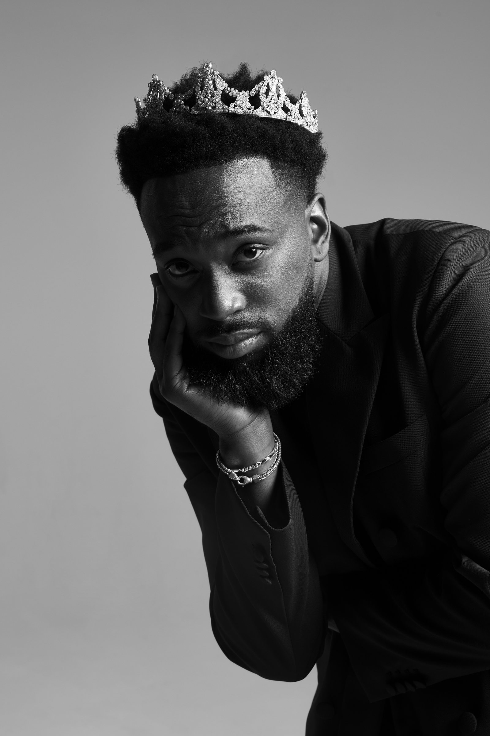
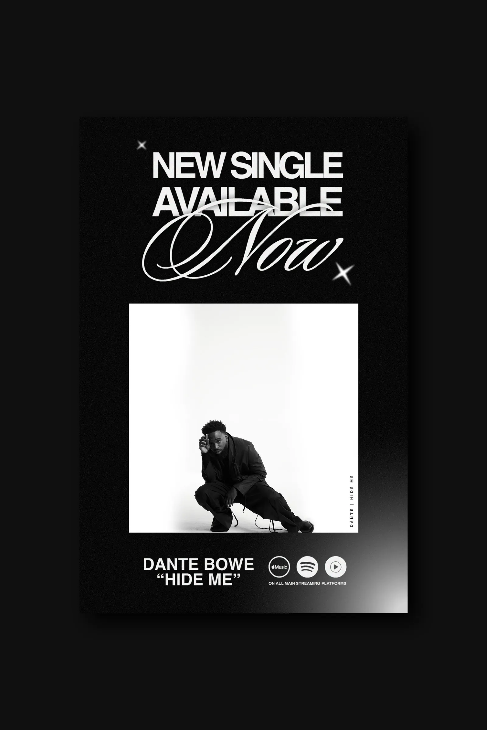
Dante Bowe's voice carries its own weather. Around award-winning debuts and singles like “Hide Me,” the visuals had to agree with it — warm, honest, full of air and reverence.
The hard part was not making one beautiful piece. It was holding a single visual language across radically different surfaces — album art, drop posters, stage moments, socials — through an era of constant releases, with different photographers, editors and crews touching the work every month.
Deuxmont built the language, then built the rules that let other people extend it without it drifting.
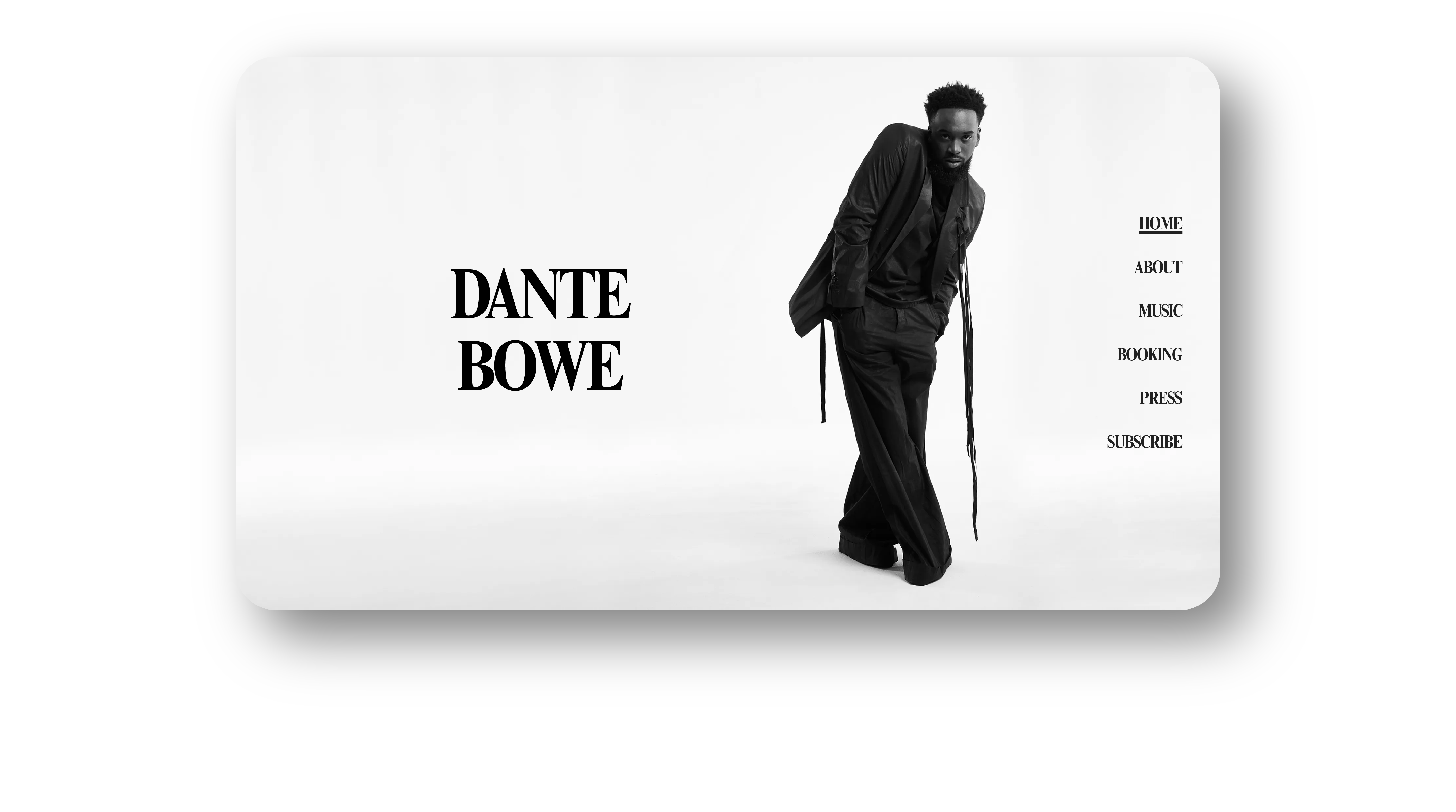
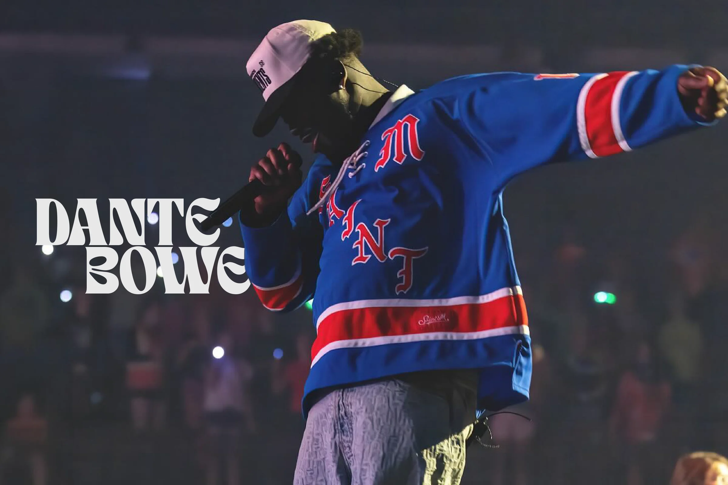
Three elements carry everything: towering serif capitals for the announcement, one elegant script gesture that breathes, and sparkle glyphs used like punctuation — never decoration.
Everything stays black and white until the light itself earns the color. That single rule is what keeps a release calendar from turning into a scrapbook: when the palette is a decision rather than a default, every warm frame lands harder.
Photography does the emotional work. Type stays disciplined so the photograph can be loud.
The announcement register. Set large, tracked open, and never crowded — the piece of the system that has to read from the back of a room.
One handwritten word per composition. It is the human moment in an otherwise formal layout, and it is never used twice in the same piece.
Punctuation, not ornament. They mark a beat, close a line, or hold a corner — the smallest recurring signature across every drop.
#000000#EDE7DD#C9A272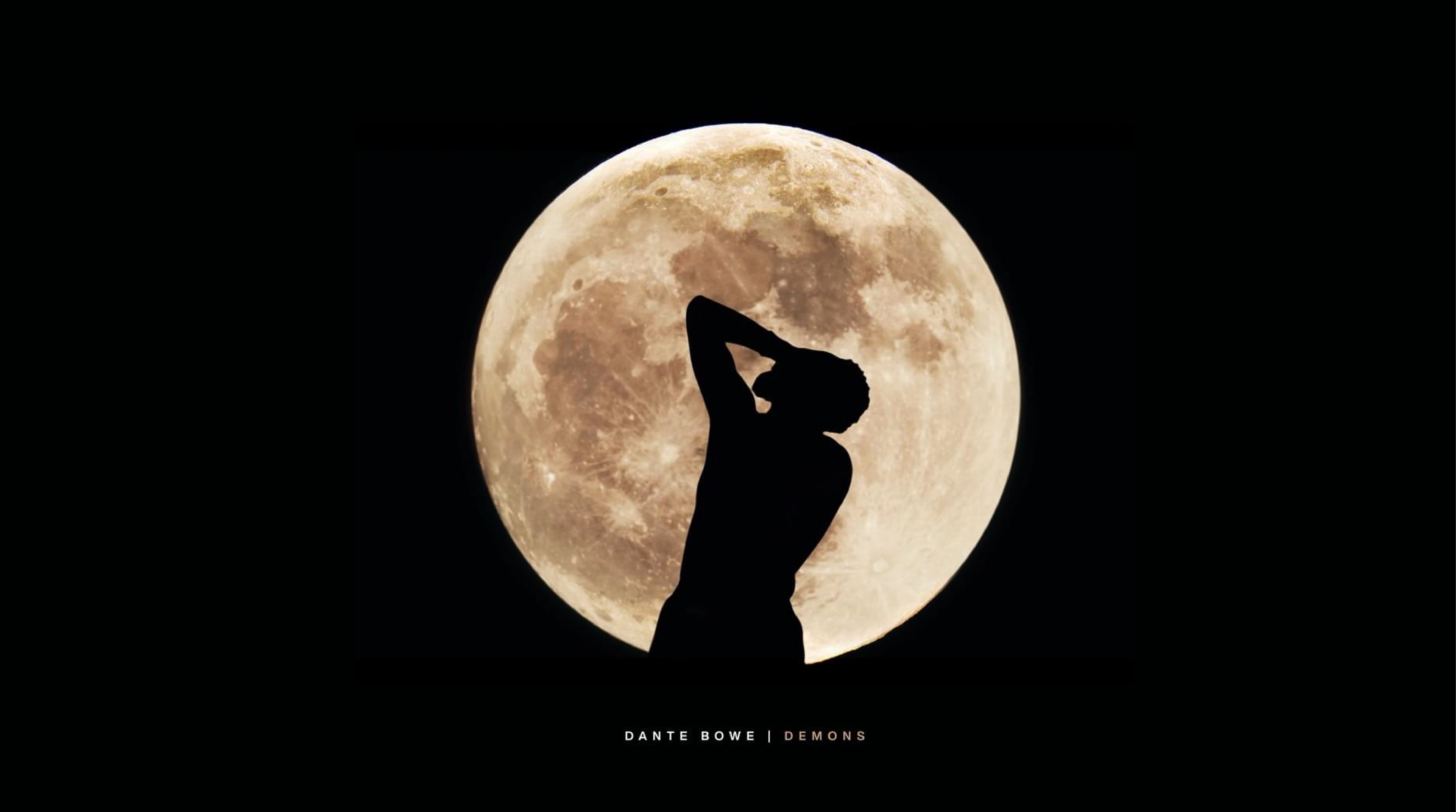
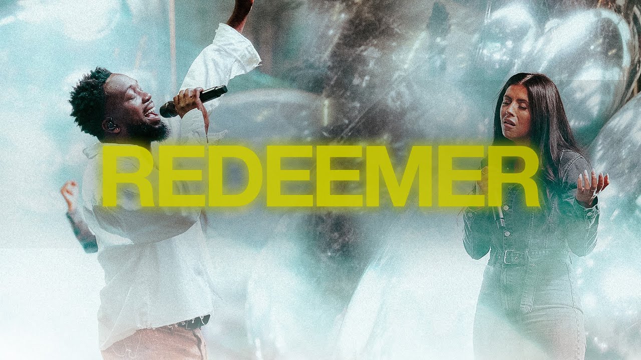
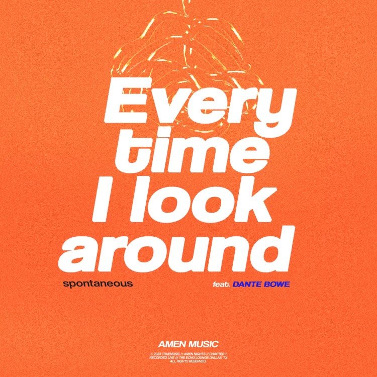
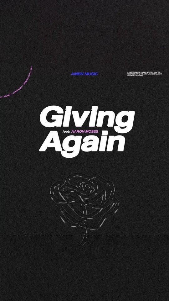
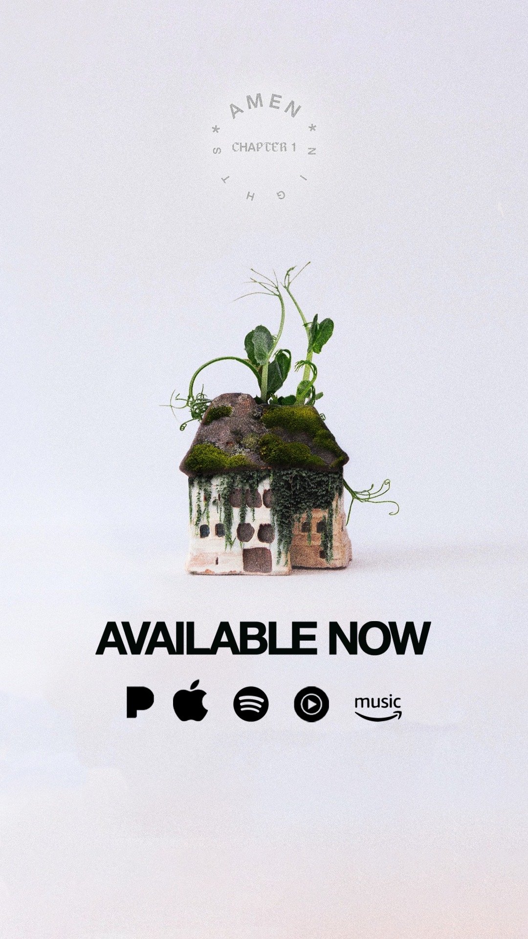
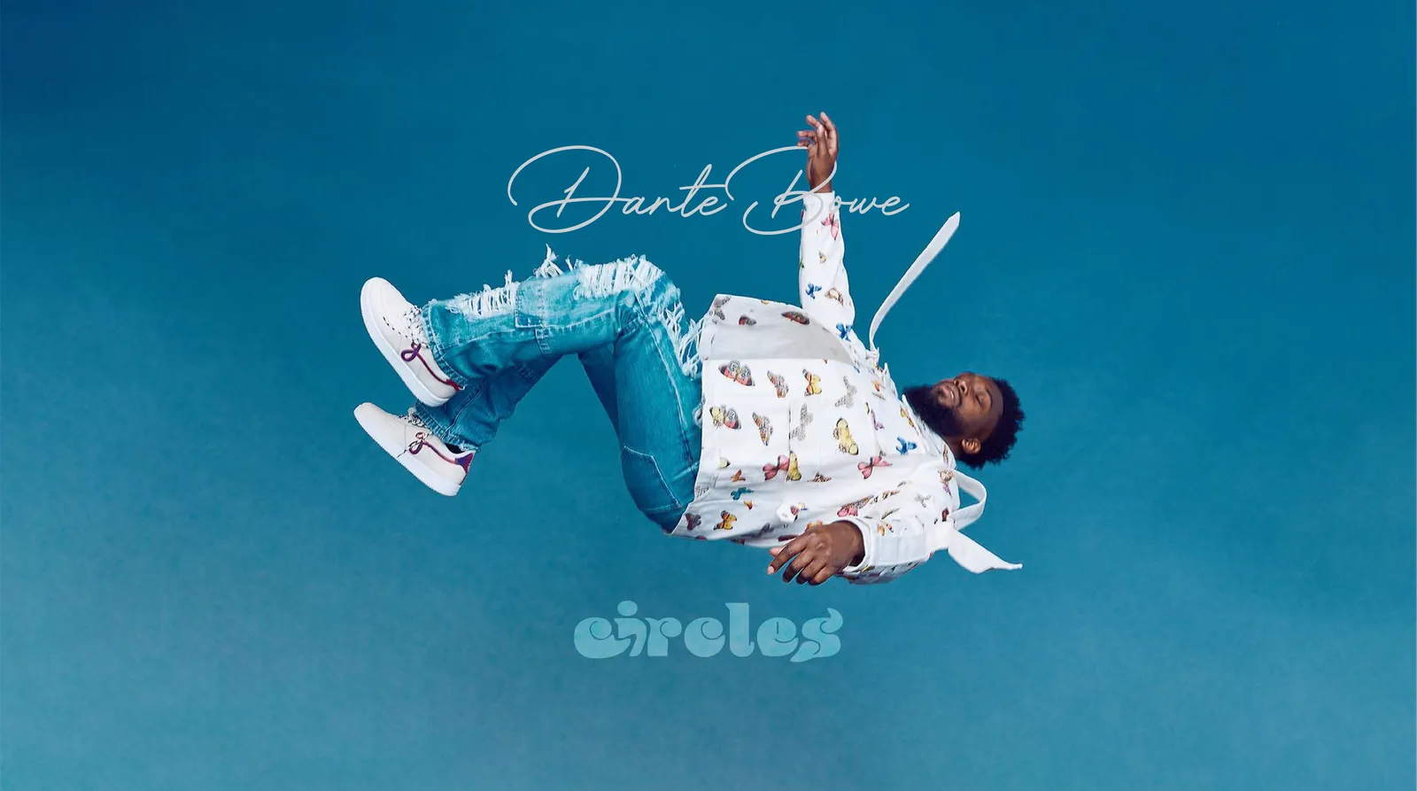
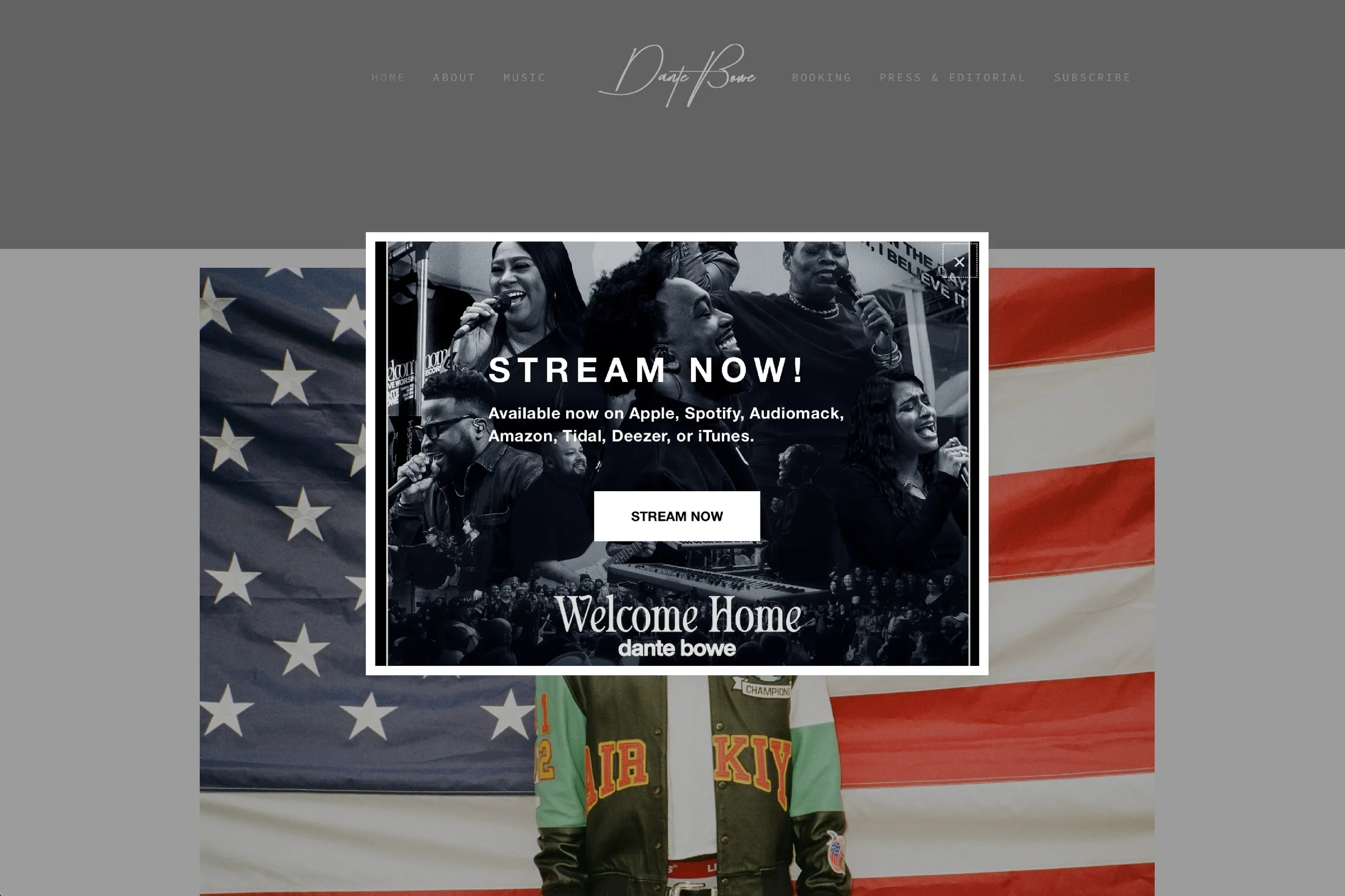
An artist site is not a portfolio — it is a release surface. It has to absorb a new drop every few weeks without a redesign, and it has to feel like the record while it does it.
The flagship site and the album microsite run on the same three elements as the print work: serif capitals, one script gesture, monochrome photography with air around it. Streaming links, tour and press slot into the grid rather than fighting it.
Because the rules were written down, the team could ship the next campaign without a call.
Set the era's visual thesis and held it across every release, every collaborator and every surface.
Cover art and drop posters built on one grammar — serif capitals, script gesture, sparkle punctuation.
Creative support for music videos and teasers, with title treatments and grade references that match the print work.
Stage and space treatments so the live moment reads as the same era as the artwork.
One-page atmosphere specs for photographers, editors and crews — so nobody has to guess at the frame.
“Nobody said ‘nice visuals.’ They said it felt like the songs. Better review.”Deuxmont · Creative Direction
If your releases keep starting from zero, the problem is not the artwork. It's the language underneath it.
Start a Project