
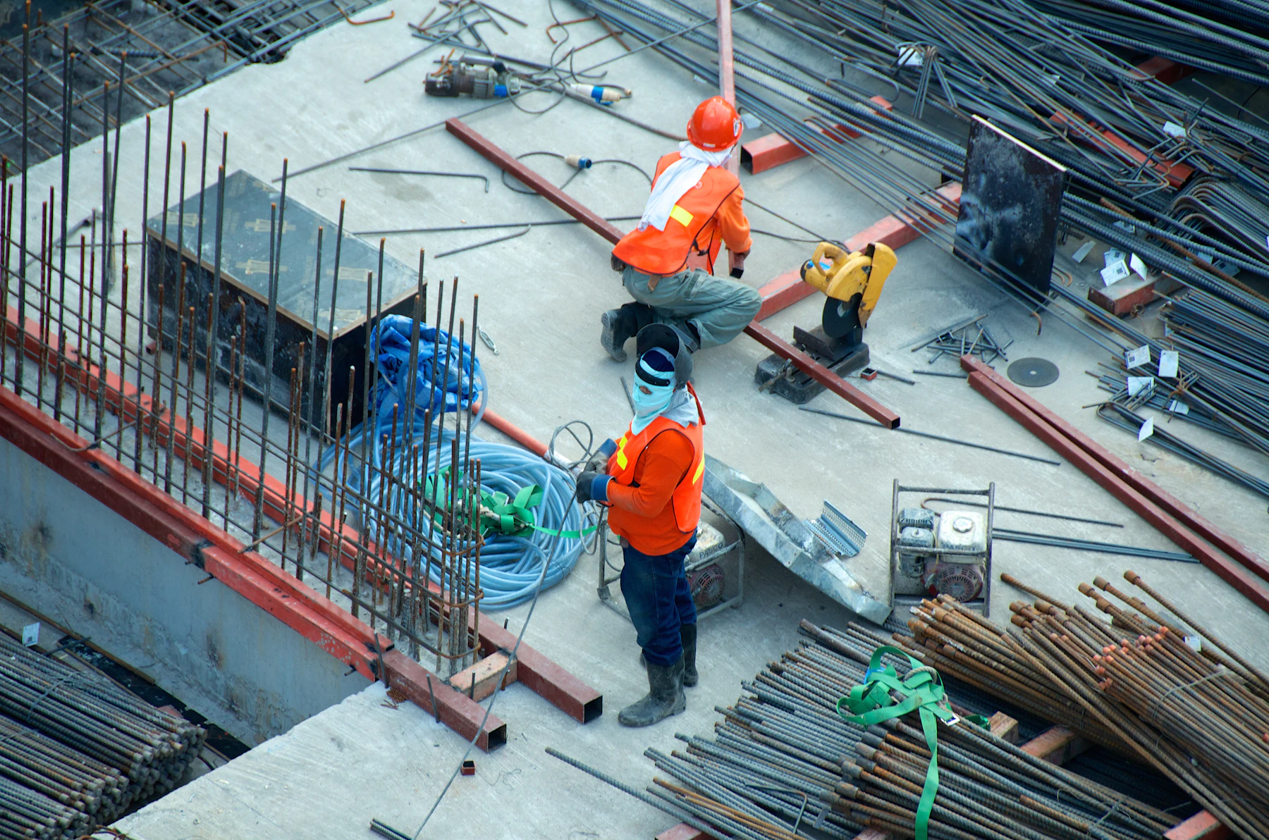
Case Study — VMAX Construction
Built with force.
Finished with discipline.

$400M+In Builds
VMAXInc Construction
Scroll
Case Study — VMAX Construction
VMAX needed to move away from the earlier red, blue, yellow, and black direction and into a palette that felt more ownable for construction: gold, black, white, and strong industrial contrast.
The refreshed system keeps the confidence, structure, and geometric weight of the original idea, but strips away the primary-color influence in favor of a more premium, forceful brand language. Gold becomes the signal of value and craft. Black becomes the foundation of strength. White gives the system breathing room.
The result is a single-scroll brand experience that feels sharper, more elevated, and more aligned with the VMAX mark itself.

The VMAX mark already has a heavy, angular presence. The updated brand system leans into that structure with large typography, bold black frames, gold gradient accents, and image treatments that make the site feel durable, premium, and modern.


Ready to build something that matches the scale of what you do?
Start a Project →